
실제로 개발을 하다 보면 custom view를 만들어야 하는 경우가 종종 발생합니다. 여러뷰를 합친 view group 역할을 하는 custom view를 생성해야 할 때도 있고, 단일 view에서 내부적인 아이템 배치를 다르게 하기 위해서 custom view를 만들기도 합니다.
이미 compose에서 Layout을 이용하여 custom view를 만드는 기본적인 방법은 앞쪽에서 설명했습니다.[2] 이번에는 좀 더 복잡한 staggered layout을 만들어 보도록 하겠습니다. 물론 기본적인 내용만 알고 있다면 쉽게 만들 수 있습니다.
이 글은 Android developer 공식사이트에서 제공하는 문서를 기반으로 의역, 번역하였습니다. [1]

위 그림은 안드로이드에서 제공하는 Material Study Owl'의 화면으로 중간에 가로로 스크롤되는 staggered grid layout을 custom으로 만들어볼 예정입니다.
위 그림에서는 세로로 세줄, 가로로는 n개의 아이템이 배치되도록 되어 있습니다. 해당 UI의 경우 Row와 Column만으로는 만들어내기가 쉽지 않습니다. Column을 세 개 만들고 따로 가로 스크롤이 되는 게 아니라 한 번에 돼야 하며, items를 각각 분리해서 주기도 애매합니다.
따라서 items만 넘겨주면 위와 같은 형태로 그려주는 staggered gird layout 같은 경우 custom으로 만들어서 필요에 따라 재활용하도록 하는 게 더 좋습니다.
Making a staggered gird layout
일단 기본적인 Custom layout의 구조를 아래와 같이 잡습니다. rows를 인자로 받아 기본은 세줄이지만 추가할 수 있도록 지정했습니다.
@Composable
fun StaggeredGrid(modifier: Modifier = Modifier,
                  rows: Int = 3,
                  content: @Composable () -> Unit) {
    Layout(modifier = modifier, content = content) { measurables, constraints ->
       ...
    }
}
첫 번째로 할 일은 child elememts를 measure 하는 일입니다. (물론 measure는 한 번만 해야 합니다.) measure 된 값들을 이용하여 최종적으로 custom layout의 size를 결정해야 해야 하기 때문에 각 child elements에 대한 measure값을 tracking 하도록 합니다.
최종적인 Staggered grid layout의 크기는 아래같이 계산해야 합니다.
- width: child를 순서대로 각 row에 배치 -> 각 row별로 배치된 child의 width값을 모두 합산 -> 합산된 width가 가장 긴 row가 staggered layout의 width가 됨
- height: child를 순서대로 각 row에 배치 -> 각 row별로 배치된 child의 height 중 가장 큰 값을 도출 -> 각 row가 같은 height를 모두 합산한 값이 staggered layout의 height가 됨
그럼 먼저 child를 measure 하면서 각 row별 width와 height를 변수에 저장하도록 하겠습니다.
@Composable
fun StaggeredGrid(modifier: Modifier = Modifier,
                  rows: Int = 3,
                  content: @Composable () -> Unit) {
    Layout(modifier = modifier, content = content) { measurables, constraints ->
        // 각 row의 전체 width 저장 변수
        val rowWidths = IntArray(rows) { 0 }

        // 각 row의 최대 height 저장 변수
        val rowHeights = IntArray(rows) { 0 }

        // Don't constrain child views further, measure them with given constraints
        // List of measured children
        val placeables = measurables.mapIndexed { index, measurable ->
            // Measure each child
            val placeable = measurable.measure(constraints)
            // Track the width and max height of each row
            val row = index % rows
            //child elements의 각 width를 누적
            rowWidths[row] += placeable.width
            // 해당 row에 저장되는 child elements중 최대 height를 갖는 값을 저장
            rowHeights[row] = max(rowHeights[row], placeable.height)
            placeable
        }

        ...
    }
}
각 child들에 대한 for문을 돌면서 measure를 하고 측정된 값을 rowWidths와 rowHeights 변수에 저장합니다. 위 코드가 수행되고 나면 rowWidhts 변수에는 각 row의 width와 rowHeights 각 row의 hegith가 저장됩니다. 따라서 저장된 (tracking 된) 값을 이용하여 최종적으로 grid layout에 대한 size를 확정할 수 있습니다.
@Composable
fun StaggeredGrid(modifier: Modifier = Modifier,
                  rows: Int = 3,
                  content: @Composable () -> Unit) {
    Layout(modifier = modifier, content = content) { measurables, constraints ->
       ...

        //  row 3개의 width중에 가장 큰값을 constraints의 min/max width 범위안에 들어오도록 맞춘다.
        val width = rowWidths.maxOrNull()
            ?.coerceIn(constraints.minWidth.rangeTo(constraints.maxWidth))
            ?: constraints.minWidth

        // 3개 row의 height를 모두 합치고 constraints의 min/max height 범위안에 들어오도록 맞춘다.
        val height = rowHeights.sumOf { it }
            .coerceIn(constraints.minHeight.rangeTo(constraints.maxHeight))

        ...
    }
}
위에서 언급했듯이 layout의 width는 세줄의 width 중 가장 긴 값으로 채택하며, height는 세줄의 height를 모두 합산하여 사용합니다. 이때 coerceIn 연산자를 이용하여 부모로 받은 제약조건 부합되도록 값을 설정합니다.
widith와 height를 가 정해졌으니 이제 layout()으로 크기를 확정하고 child를 화면에 배치합니다. child의 x, y position은 아래와 같이 계산될 수 있습니다.
rowY 변수를 만들고 각 row에 배치되는 아이템의 y position값을 갖습니다.
- 첫 번째 줄 y position = 0
- 두 번째 줄 y position = 첫 번째 줄 rowHeights
- 세 번째 줄y position = 첫번째줄 rowHeights + 두 번째 줄 rowHeights
rowX 변수를 만들고 각 row에 배치되는 아이템의 width를 누적 합산한 값을 갖도록 합니다.
- 첫 번째 item의 x position = 0
- 두 번째 item의 x position = 첫 번째 item의 width
- 세 번째 item의 x position = 첫번째 item의 width + 두 번째 item의 width
- 네 번째 item의 x position = 첫번째 item의 width + 두 번째 item의 width + 세 번째 item의 width
- ...
@Composable
fun StaggeredGrid(modifier: Modifier = Modifier,
                  rows: Int = 3,
                  content: @Composable () -> Unit) {
    Layout(modifier = modifier, content = content) { measurables, constraints ->
        ...
        // 각 row의 y position을 저장한다. 각 row의 y 값은 이전 row의 height의 누적값이다.
        val rowY = IntArray(rows) { 0 }
        for (i in 1 until rows) {
            rowY[i] = rowY[i-1] + rowHeights[i-1]
        }

        // 3개의 row중 가장 긴 width와 3개의 row height를 합쳐서 이 layout의 크기를 확정시킨다.
        layout(width, height) {
            // 각 row별로 child의 width를 누적하면서 child element의 x 값으로 사용한다.
            val rowX = IntArray(rows) { 0 }

            placeables.forEachIndexed { index, placeable ->
                val row = index % rows
                placeable.placeRelative(x = rowX[row], y = rowY[row])
                rowX[row] += placeable.width
            }
        }
    }
}
layout의 block 내부에서 child의 배치를 위해 placeRelative를 호출하여 화면에 보이도록 합니다.
최종 코드는 아래와 같습니다.
@Composable
fun StaggeredGrid(modifier: Modifier = Modifier,
                  rows: Int = 3,
                  content: @Composable () -> Unit) {
    Layout(modifier = modifier, content = content) { measurables, constraints ->
        // 각 row의 전체 width 저장 변수
        val rowWidths = IntArray(rows) { 0 }

        // 각 row의 최대 height 저장 변수
        val rowHeights = IntArray(rows) { 0 }

        // Don't constrain child views further, measure them with given constraints
        // List of measured children
        val placeables = measurables.mapIndexed { index, measurable ->
            // Measure each child
            val placeable = measurable.measure(constraints)
            // Track the width and max height of each row
            val row = index % rows
            //child elements의 각 width를 누적
            rowWidths[row] += placeable.width
            // 해당 row에 저장되는 child elements중 최대 height를 갖는 값을 저장
            rowHeights[row] = max(rowHeights[row], placeable.height)
            placeable
        }

        //  row 3개의 width중에 가장 큰값을 constraints의 min/max width 범위안에 들어오도록 맞춘다.
        val width = rowWidths.maxOrNull()
            ?.coerceIn(constraints.minWidth.rangeTo(constraints.maxWidth))
            ?: constraints.minWidth

        // 3개 row의 height를 모두 합치고 constraints의 min/max height 범위안에 들어오도록 맞춘다.
        val height = rowHeights.sumOf { it }
            .coerceIn(constraints.minHeight.rangeTo(constraints.maxHeight))

        // 각 row의 y position을 저장한다. 각 row의 y 값은 이전 row의 height의 누적값이다.
        val rowY = IntArray(rows) { 0 }
        for (i in 1 until rows) {
            rowY[i] = rowY[i-1] + rowHeights[i-1]
        }

        // 3개의 row중 가장 긴 width와 3개의 row height를 합쳐서 이 layout의 크기를 확정시킨다.
        layout(width, height) {
            // 각 row별로 child의 width를 누적하면서 child element의 x 값으로 사용한다.
            val rowX = IntArray(rows) { 0 }

            placeables.forEachIndexed { index, placeable ->
                val row = index % rows
                placeable.placeRelative(x = rowX[row], y = rowY[row])
                rowX[row] += placeable.width
            }
        }
    }
}
Using the custom StaggeredGrid in an example
이제 Test를 위해 간단하게 child로 쓰일 compose를 만들어 봅니다.
@Composable
fun Chip(modifier: Modifier = Modifier, text: String) {
Card(
modifier = modifier,
border = BorderStroke(color = Color.Black, width = Dp.Hairline),
shape = RoundedCornerShape(8.dp)
) {
Row(modifier = Modifier.padding(start = 8.dp, top = 4.dp, end = 8.dp, bottom = 4.dp),
verticalAlignment = Alignment.CenterVertically
) {
Box(modifier = Modifier.size(16.dp, 16.dp)
.background(color = MaterialTheme.colors.secondary)
)
Spacer(Modifier.width(4.dp))
Text(text = text)
}
}
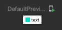
}위 코드를 수행하면 아래와 같은 compose를 얻습니다.
이제 text list를 만들어 실제 staggered layout에 넣어주도록 합니다.
val topics = listOf(
    "Arts & Crafts", "Beauty", "Books", "Business", "Comics", "Culinary",
    "Design", "Fashion", "Film", "History", "Maths", "Music", "People", "Philosophy",
    "Religion", "Social sciences", "Technology", "TV", "Writing"
)

@Composable
fun BodyContent(modifier: Modifier = Modifier) {
    StaggeredGrid(modifier = modifier) {
        for (topic in topics) {
            Chip(modifier = Modifier.padding(8.dp), text = topic)
        }
    }
}

@Preview(showBackground = true)
@Composable
fun DefaultPreview() {
    ComposeTestTheme {
        BodyContent()
    }
}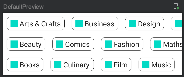
원했던 형태로 잘 표현됨을 알 수 있습니다. 또한 row를 4, 5등으로 바꾸면 해당 row로 잘 맞춰져서 나오게 됩니다.
이를 응용하면 옆이 아닌 아래로의 staggered gird layout도 충분히 만들 수 있습니다.
References
[2] 2021.09.30 - [개발이야기/Android] - [Compose] 7.Custom Layout
'개발이야기 > Android' 카테고리의 다른 글
| [Compose] 10. Intrinsic Measure (0) | 2021.10.04 |
|---|---|
| [Compose] 9. Constraint layout (0) | 2021.10.04 |
| [Compose] 7.Custom Layout (0) | 2021.09.30 |
| [Compose] 6. Side-effects - LaunchedEffect, rememberCoroutineScope, rememberUpdatedState, DisposableEffect, SideEffect, produceState, derivedStateOf, snapshotFlow (13) | 2021.09.25 |
| [Compose] 5. LifeCycle, Recomposition의 내부 동작, Call site, @Stable (0) | 2021.09.21 |
